Here are the improvements we've been working on lately, all live. We've been focussed on quick wins to make using the site easier – but we know there is still some way to go.
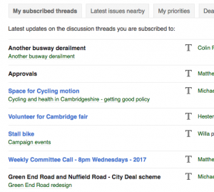
Unread postings now coloured differently: All around the site, unread postings are marked in blue in discussion threads you haven't yet read. This should make it much easier to keep track of things!

Front page – My Cyclescape: We've at long last cleaned up your My Cyclescape page, getting rid of pointless boxes and giving it a spring clean. Also, the limit of 12 messages before has gone – you can now click through to the next page of updates. So if you haven't been to the site for a while, you can be sure not to miss anything.
Layout improvements: To save you having to scroll back to the top of a page, we've set the top bar to stay in place all the time now. Also, there's a link in the bottom corner to the top of the page. Another little fix has been to make the list of subscribers to a discussion clearer – people are now listed in a sensible alphabetical order at last.
E-mail improvements: You can now unsubscribe from a discussion thread on a topic in one click – before this involved remembering to click the unsubscribe button. For digest users, the e-mails now include a link to the original of each individual message. Also, members of a committee getting committee-only e-mails will see this more clearly marked now.
Direct messaging: The top bar now has an 'envelope' icon, giving you access to direct messages. It'll show you how many unread messages there are, to help you avoid missing any.
![]()
Closing a thread: To help keep the site clean, you can close a thread using the button at the end of the discussion. This can now be done at any time – previously there was an arbitrary 2-day wait which we've now removed. People can re-open threads just by posting again, but by closing old threads, searches and other listings will work better.
![]()
Issues can now have more than one location: You can now report an issue that has a set of locations. For instance, supposing the council is consulting on making a set of one-way streets to way for cycling. Previously, this was hard to represent – it meant either drawing a large box or a convoluted area. Now you can draw a line for each street when creating the area. The same multiple area system also applies to groups and library items.
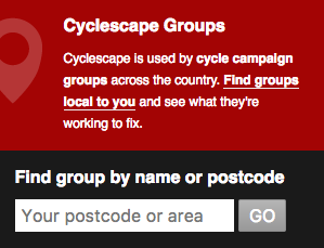
Improvements for groups: There's now a group finder on the front page. It's now also possible to request to create a new group online. Also, committee members are now automatically subscribed to administrative discussion threads.
Potential members list: The membership secretary of a group can now paste in their membership list (as a list of e-mails), so when a user signs up they are automatically added to the group if their email matches one in the potential members list. This system is fully privacy compliant, as we don't store the e-mails of potential members – just an alphanumeric code representation of each e-mail.
You can see the full list of changes (available via the 'What's new' link at the bottom of all pages of the site).
 This work has been possible kindly thanks to grant support from the Polden-Puckham Charitable Foundation. Thanks also to Nikolai and other contributors who have made these improvements possible.

