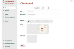
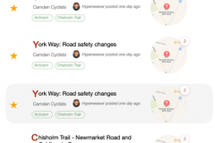
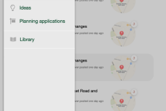
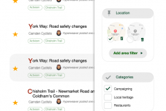
We've been working with our designer, Patrick, to create the designs throughout the site.
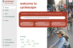
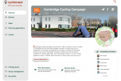
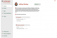
As you can see, these modernise the look and feel of the site, and deal with a lot of usability issues
The changes overall are:
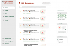
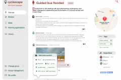
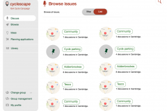
- We remove the concept of issues vs threads and just have discussions – which are then linked together by tags.
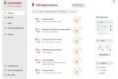
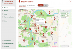
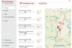
- As a result, we now simplify all the various listings down to a single page, with filtering.
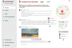
- Filter panel on the right, so that discussions can be easily filtered.
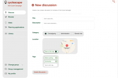
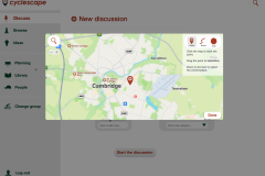
- There is no up-front requirement to set an area – by default the discussions shown will be everything from the group, but a geographical filter can be set if wanted, using the right-side panel.
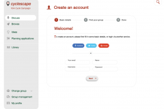
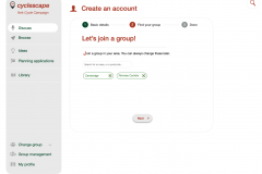
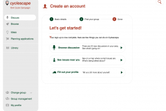
- New account creation is much simpler, so we don't put people off getting involved.
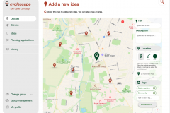
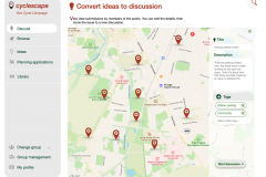
- The public can now submit ideas, and site users can then pluck these off the map to turn them into a discussion.
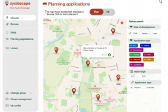
- Similarly, there is a map of planning applications that can easily be turned into a discussion.
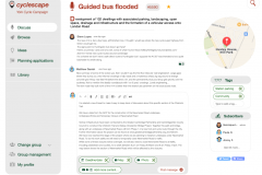
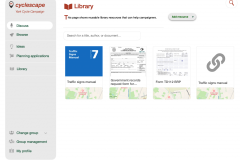
- In the reply box, attaching other media now has a far more sensible user interface.
- The site's look and feel is modernised and friendly.
- Have proper mobile responsiveness.

This looks much simpler, cleaner and more enagaging… Cyclescape has long been an underused resource, hopefully this will make a difference to how much traction and engagemnet it can generate
Good evening,
We did start using cyclescape a few years ago but it never really picked up, we're looking at pushing again with a bit more intention. Do you have a target for when you think the new look site will be live, as it would be good to coincide our new push with the launch so that there's a) not a sudden change in UI just as people get into it, b) I think the new UI will be more inviting and help with uptake