Redesign beta

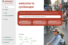
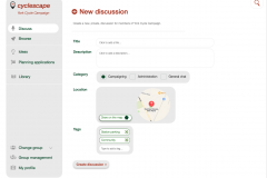
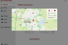
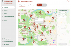
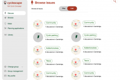
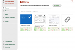
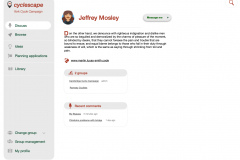
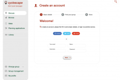
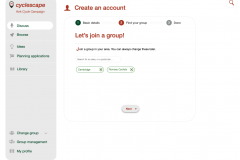
We've now got the new site designs turned into browsable demo pages - though not plugged into the real site database yet! They're just sample pages that show what the site will feel like so people can give feedback.

You can see the demo pages at:
https://redesign.cyclescape.org/

Please browse around, try it on different devices (it's designed to adjust well to mobile) and let us know your thoughts.

The key changes from the live site to the new design are:

  1. The design is modernised, and the site is now mobile-friendly automatically.
  2. We've got rid of issues vs threads - instead, each discussion is a standalone discussion, linked using tags.
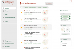
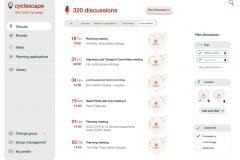
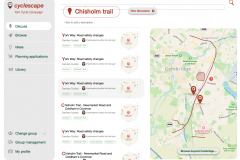
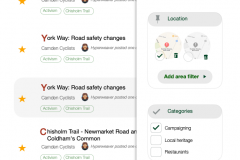
  3. The main Discuss page is a combination of the old My Cyclescape and various other listings - by default, it shows you all discussions in your group, but if you find there are too many discussions, you can use the map filtering on the right which will let you change from everything in the group's area, to any areas you define.
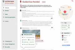
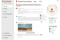
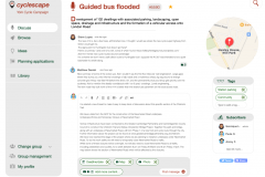
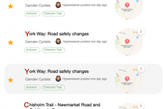
  4. The discussion page works much more like modern social media sites - you will see the latest unread discussions, and you'll be able to scroll up to see earlier discussion. No more long scrolling down the page to see things!
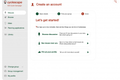
  5. The signup process is much simpler. No need to define map areas either! We want to remove barriers to getting new people involved, a key problem on the current site.
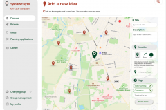
  6. There's a new Add a new idea section which will allow general members of the public to submit ideas that campaigner members can 'cherry-pick' off the map. This probably won't make the initial launch.

Bear in mind the following points when looking around the sample pages:

  • It's not a real live website - the pages won't actually submit any information, show real discussions or let you log in.
  • There's a single page to represent all the parts of the site, but each just has sample info, e.g. the profile page gives an idea of what a person's profile is like.
  • There are a few inconsistencies, e.g. some parts say York vs Camden for the campaign group. Don't worry about that kind of thing. (We used a range of labels to ensure that text will fit properly.)
  • Pretty-much all functionality has been carried over. Nothing significant (e.g. e-mail integration) has been removed.
  • The map displays don't currently show clickable pins in this demo.

To give us feedback, please use the live site's feedback page. (The demo one in the new design obviously won't work!)

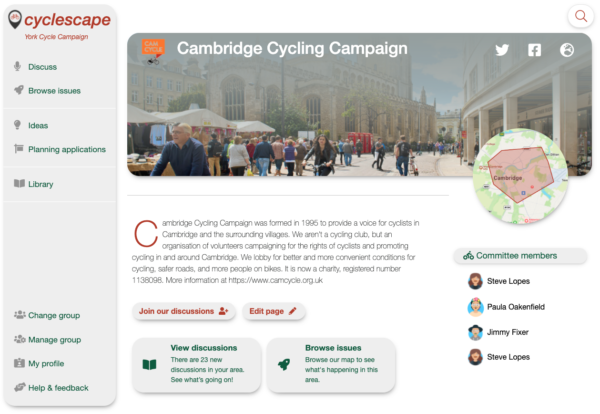
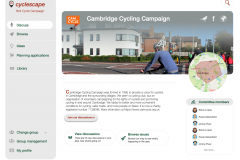
Example group homepage
An example group homepage

Thanks to Patrick for his hard work on the design and the HTMLification.

Redesign drafts

We've been working with our designer, Patrick, to create the designs throughout the site.

As you can see, these modernise the look and feel of the site, and deal with a lot of usability issues

The changes overall are:

  • We remove the concept of issues vs threads and just have discussions - which are then linked together by tags.
  • As a result, we now simplify all the various listings down to a single page, with filtering.
  • Filter panel on the right, so that discussions can be easily filtered.
  • There is no up-front requirement to set an area - by default the discussions shown will be everything from the group, but a geographical filter can be set if wanted, using the right-side panel.
  • New account creation is much simpler, so we don't put people off getting involved.
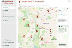
  • The public can now submit ideas, and site users can then pluck these off the map to turn them into a discussion.
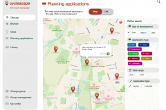
  • Similarly, there is a map of planning applications that can easily be turned into a discussion.
  • In the reply box, attaching other media now has a far more sensible user interface.
  • The site's look and feel is modernised and friendly.
  • Have proper mobile responsiveness.

Redesign proposals – give us your thoughts!

We've been talking to users of the site, and have come forward with a set of proposed changes to how Cyclescape works, which will make it easier to use, as well as ensuring that more issues get lodged.

Proposed Cyclescape changes - draft wireframes (version 1, 7th February)

Proposed Cyclescape screen wireframes (version 2, 23rd February)

Update May 2021: Due to the pandemic, work on taking these forward got paused, but we are pleased to say that the design work is progressing again at last.

Redesign coming soon

Over the last five years, we've received lots of feedback about the Cyclescape website, which started in 2012, as well as much experience ourselves as users.

As a result of funding from our new project StreetFocus, we're pleased to announce that we will shortly be starting work on a full-scale redesign of the Cyclescape site. We expect the design work to be finalised in February and will then be rolling out as developer time permits shortly after that.

This will be a full-scale revamp. As well as a fresh visual look and a new mobile-friendly interface, this will tackle seven key areas of usability:

  1. Generally, reorganising screens to reduce confusion and make the site concepts much clearer and easier to understand;
  2. User onboarding process is poor - currently users have to go through far too many screens to get set up;
  3. Lightweight issue reporting model, so that many more issues can be reported in a more lightweight way;
  4. The issues map is unusable when many area-wide issues present - we want the map to be a stronger focus, and much nicer;
  5. Subscription by theme, e.g. ‘cycle parking’ rather than purely by geographical area;
  6. Dealing with general chat discussions that are neither geographical nor administrative, which has always never really worked;
  7. Planning application integration to add new features such as automatically linking to key documents.

Please do take the opportunity to fill in our survey to give us your thoughts on the site.


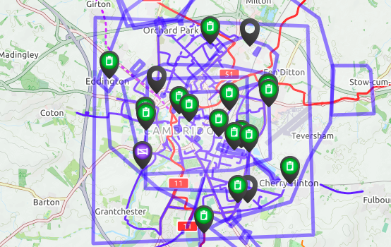
An unusable map - one of the many problems we plan to tackle

Survey – what would you most like us to improve?

We're busy working on various improvements and new features for Cyclescape, and we know there are usability things still needing work. So we'd really welcome your views on what your priorities for improvement would be.

Please fill in our quick survey!

We've also recently obtained a grant from Innovate UK / Geospatial Commission, for a project called StreetFocus, which will help us improve the ability of Cyclescape users to look at planning applications.

We're planning to run a user workshop in October, with a view to doing a fuller redesign of the site soon. We'd be interested to know if you'd like to attend.

PS All commnts submitted are anonymous - please be as honest as you can!

Latest new features – Summer 2017

Lots of new smaller features have gone live in recent months:

Thumbs up: You can now thumb-up (or 'like') a posting. It's a useful and quick way of showing approval to what someone else has written. You can hover your mouse over the thumb and see who has liked it. Thumbs-up is also installed on each issue - replacing the old voting system.

Hashtags to link posts together: You can link disparate messages from around the site together by using hashtags. This works in basically the same way to other sites like Facebook. Just prefix a word with a hash sign (#) and it will turn into a link to a page showing all the other messages containing that hashtag. This is specific to each group. So, for instance, members of Placeford Cycling Campaign could mark items that could go into their newsletter just by writing #newsletter in a post. There's also an index of all hashtags for each group.

Planning applications: Thanks to PlanIt, with whom we have been working, planning applications from some 78% of councils around the country are now coming through to Cyclescape, via your My Cyclescape page. This gives you easy access to development proposals in your areas, usually within a few days of them being posted on your council's website. If you know about an existing development, you can now paste its number into the search box to get to it quickly.

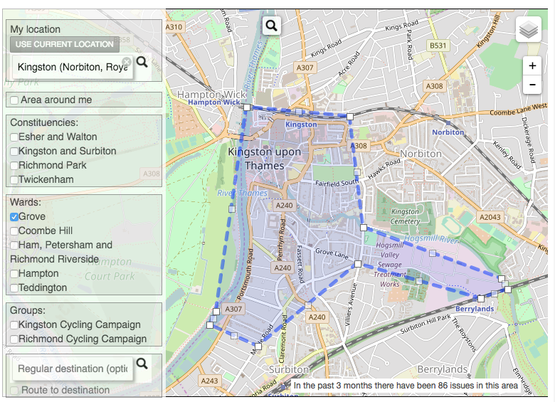
Revamp for setting locations you're interested in: We've completely reworked the way you specify what areas you're interested in. Now you can type in an area, e.g. your local council ward, and the system will come up with a set of suggested areas you might like to follow. This means you don't have to know how to read a map (and then draw on it) to set it - now you can search by name. We've got groups, constituencies and wards all loaded. You can also plan a cycle journey to get an A-B route you want to monitor, e.g. so that you get told about issues along your way to work that other people have reported. The new interface also show you how many issues the areas you've selected would match - so you know whether you'll get more than you can handle. We'll have a blog post about this soon, and will be making further improvements to it, as there are some rough edges still.

You can see the full list of changes (available via the 'What's new' link at the bottom of all pages of the site).

Now that we've got these in place, we'll be starting soon (subject to funding) on a long-awaited major revamp of the layout of the site, moving things around to make everything much clearer, as we know that new users are still confused by how to subscribe to things.

Polden-Puckham Charitable FoundationThis work has been possible kindly thanks to grant support from the Polden-Puckham Charitable Foundation. Thanks also to Nikolai and other contributors who have made these improvements possible.
Developer API

This is a techie blog post, for the information of developers. If you're an ordinary user, you'll probably want to skip this post!

Cyclescape now has a fledgling developer API is now available.

Basically, this enables data in Cyclescape (public information - no personal data is involved) to be used in external systems, making it more useful.

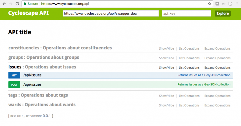
Currently available API calls, as described in the documentation, are:

  • Issues - what problems exist, and when were they reported?
  • Groups - cycling groups around the country and their geographical areas
  • Tags - what are the themes of problems that people are talking about?

Here are the first two integrations, by way of example:

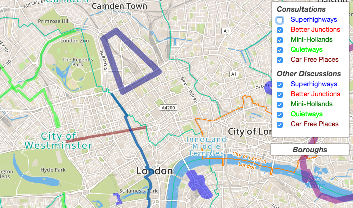
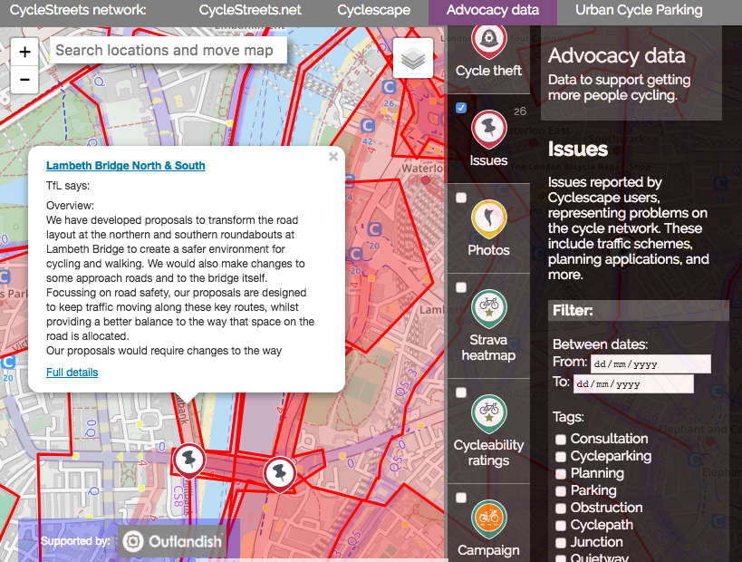
London Cycling Campaign's consultation map

London Cycling Campaign are using this to create a map of current consultations in London, thanks to work by Camden Cyclists.

You can create a similar map using the code for the map, which is open source.

Bikedata

CycleStreets (who run Cyclescape) has been working on a new website, Bikedata.

The Bikedata site aims to provide cycle campaigners around the UK with a ‘one-stop shop’ for data that helps them in their work. You can read more about the Bikedata site.

We've used the API to pass through reported issues on Cyclescape to Bikedata.

We've also added a layer showing all groups.

API documentation

Documentation of the API is available at:
https://www.cyclescape.org/api

Geographical data is GeoJSON, making it easy to add to a Leaflet or other map.

Usage policy

We don't currently have an API usage policy, but for now, we would expect users to adhere to standard principles:

  • Avoid excessive volumes of requests to the server;
  • Limit the geographical size to only what is needed;
  • Ensure you give attribution;
  • Link back to the site, rather than copying material which will then go out of date.

Future developments

We expect that more API calls will be added in future. Let us know if you have any particular requests for the API.

Polden-Puckham Charitable FoundationThis work has been possible kindly thanks to grant support from the Polden-Puckham Charitable Foundation. Thanks also to Nikolai and other contributors who have made these improvements possible.
Survey

We're busy working on various improvements and new features for Cyclescape, and we know there are usability things still needing work. So we'd really welcome your views on what your priorities for improvement would be.

Please fill in our quick survey!

We'll be also including comments received in our report to funding bodies that we've obtained a grant from.

All comments submitted are anonymous - please be as honest as you can!

Deadline management improvements

One of Cyclescape's features to help cycle campaign members is the ability to add a deadline/date as a type of message posting.

We've made some improvements to make better use of these postings.

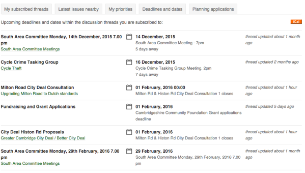
In case you didn't know, your 'My Cyclescape' page has a listing of all the deadlines/dates in the threads you are subscribed to. So it's easy to get an overview of what's coming up:

Deadlines listing

Firstly, we've added an iCal feed, so that if you use a calendaring system like Apple Calendar, Google Calendar, Outlook, etc., you can have these events appear automatically in your calendar.

In most systems you can click on the orange iCal link in the top-right to add the calendar, or for web-based systems like Google Calendar, right-click and choose 'Copy link', then add that web address in the relevant part of the calendar system's interface.

If you have e-mail enabled, each deadline/date e-mail will now include an iCal attachment for that deadline/date.

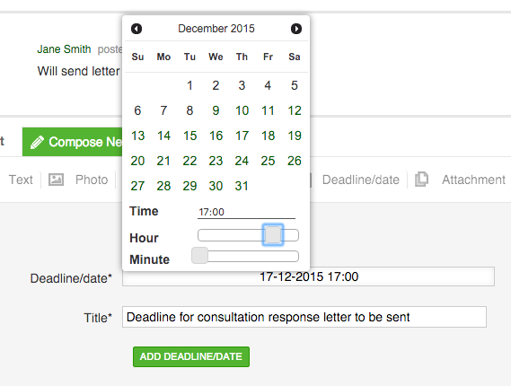
Another improvement is that you can now specify a time, rather than purely just a day. This is particularly helpful if you're using the calendar integration, to avoid full days appearing.

Set a deadline

Lastly, for e-mail users, Cyclescape now also sends out a reminder e-mails a day or two before a deadline, as mentioned in our previous blog post:

Reminder e-mails

Improvements we plan to add next are some instructions for different calendaring systems, better support for iCal with Outlook (which is known to have bugs relating to multiple iCal entries), optional notifications by SMS, reminder notifications for non-e-mail users, and time range support.

This work to facilitate work by local cycling advocates has been possible thanks to grant support from the Polden-Puckham Charitable Foundation. Thanks also to our developer, Nikolai!

Getting discussions by e-mail now better

Did you know that you can also get Cyclescape discussions by e-mail?

In fact, Cyclescape can be used like lots of mini e-mail lists, which you can choose to subscribe/unsubscribe to on a per-thread basis.

We've made a number of improvements over the last month.

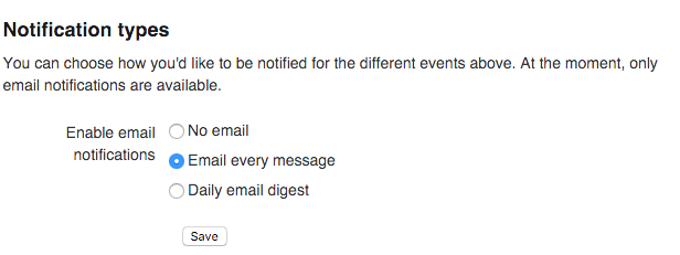
Firstly, you can now enable digests, so you can read what's happening by getting a single e-mail a day. Just head to your e-mail preferences and enable digests. Of course, the option to get one e-mail per reply, like an e-mail list, remains available.

emailpreferences

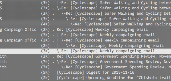
Firstly, e-mails are now properly threaded. Not the most earth-shattering change, perhaps, but for power users this is an essential bit of inbox cleanliness.

Threading

Next, we've added deadline reminders, so you'll get a reminder a day or two before a date in a thread you're subscribed to. So fewer excuses for missing deadlines now!

Reminder e-mails

Another small improvement is that we automatically strip e-mail encryption keys from messages, to avoid unnecessary attachments appearing in discussions.

We plan to redesign the layout and wording of e-mails soon, so that things like privacy settings and options are clearer. We'll also be making the new digests laid out more similarly to the classic 'mailman' layout.

In terms of general e-mails relating to signup:

  • New users now receive a welcome e-mail to confirm their signup, and to point to the settings and other things they might wish to set.
  • Users also receive an e-mail upon successfully joining a group. Committee members of the group can configure the contents of this e-mail.

This work to facilitate work by local cycling advocates has been possible thanks to grant support from the Polden-Puckham Charitable Foundation. Thanks also to our developer, Nikolai!