What we’re working to finish

Cyclescape has been used now for three months by Cambridge Cycling Campaign as our test group. We added them even though we knew not everything was in place, as it was important to get good feedback on real campaigning usage, even though that has meant some confusion in the short-term.

Over 180 issues (cycling infrastructure problems) have been posted, over 250 discussion threads on these, containing over 2,000 messages.

We've also had meetings with CTC, Cyclenation, and London Cycling Campaign to show the site as it currently stands and talk through what's done and what's not, to see what they most need:
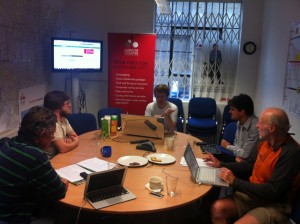
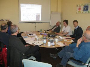
   
Meetings with London Cycling Campaign and Cyclenation / CTC

A lot of the work going on now is about tidying up and finishing off pieces of functionality, reorganising things a bit, and making things more flexible. The site isn't quite ready for wider usage, but things are falling into place.

These are the main things left now, not in any particular order, to ensure that the site will be a big step up for campaigners:

1) Settings: "What do I get told about?"

A key aspect of the site is to avoid the 'e-mail list syndrome' where everyone gets absolutely everything, which puts off people who don't have enormous amounts of time. Instead, users can outline places they want to hear about things.

a) Three months' usage of the site has clarified what the various settings should now be. This is now being finalised, as top-priority work. [Done]

b) We need a clearer route through to encourage people to set their preferences.

c) The ability to subscribe automatically to discussions based on keywords (e.g. 20mph zones) rather than purely map-based areas.
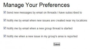

Users have found that the settings don't give them quite enough flexibility yet. The key addition about to be added is auto-subscribing, rather than just being notified.

2) User interface

Much functionality is now in place, but users are having trouble finding things. So:

a) The search box will be moved to a more accessible position and cover all types of data (issues, threads, library) [Done]

b) Reorganising the various listing screens.

c) Removing scrolling past previously-read replies. We're aiming to avoid pagination (which people don't like).

d) Tags (categories) just need an auto-complete so that 'cycle parking' comes up as soon as you start typing: p.. a...

e) Getting a more natural (and 'frictionless') connection between an issue (basically the container for discussions) and threads (the actual discussions). In general, starting a discussion on a completely new issue involves a bit too much friction, which we need to address.

f) General little bits of tidying up, improving the labelling and making the site as 'warm' as possible.


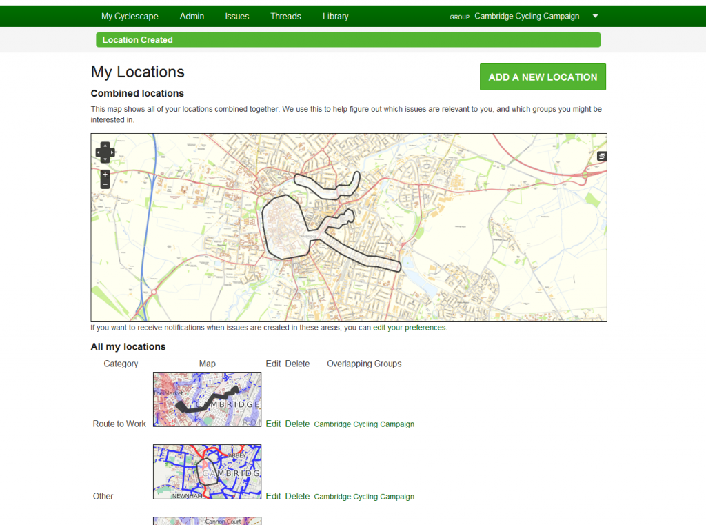
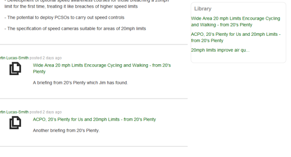
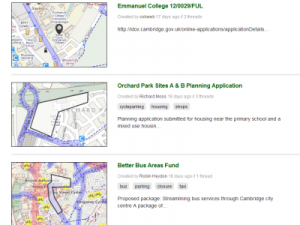
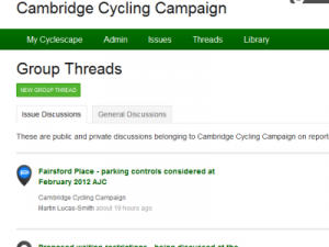
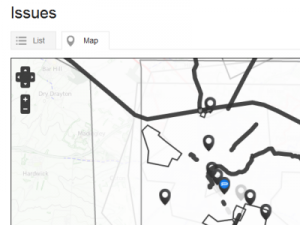
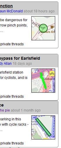
This shows three of a number of ways of viewing what's going on. There are more, and we are gaining a better insight into what users need to see to help them campaign.

3) E-mail integration

From the start, it has been a core principle that people can interact with Cyclescape via e-mail as well as the web, much like a Yahoo Group for instance.

a) At present, a discussion thread can't be started by e-mail. A key question is how to ensure this gets grouped with other discussions on a topic.

b) The ability to move an existing thead into a different issue.

c) Finishing off the work on attachments so they can be attached to an incoming e-mail.

4) The Library

The Library is a place for useful resources to be 'tagged' (categorised) so that Cyclescape can automatically suggest them in discussions. For instance, if a 20mph zone is being proposed, it makes sense for the key guidance on this to be handed to people 'on a plate'.

a) Adding to the library isn't a very smooth process at the moment. We intend to enable any reply to be 'promoted' to be a library item retrospectively.

b) More types of library item will make things a bit more flexible and improve how they appear in discussions.

c) Adding the category tags needs to be made more integrated.

The core Library functionality is there - it just needs a bit more development to ensure it's a genuinely useful campaigning resource.

5) Other features

a) A key need in Cambridge, for which we have grant funding from Cambridge Sustainable City: Getting planning applications landing on the map automatically, something we're very excited about. OpenlyLocal have been making good progress with developing the new PlanningAlerts. We've done some initial work to determine how this will work, interface-wise, to avoid lots of roof extension planning applications (etc.) appearing and cluttering things up.

b) There isn't a listing of My priorities, so there's currently no incentive to set this. Currently you can set this but it's not actually then used. [Done]

Stay tuned for news as these each get ticked off!

More features in place

Work is continuing apace with Cyclescape, with more features now in place as we work up to a wider release.

There are still quite a number of unfinished areas, but we're getting there. Andrew and (most recently) Andy have been busy adding more in place for us.

  • Deadline setting
  • Collision data
  • Per-thread attachments
  • Committee-only privacy setting
  • Popular issues

Read about these below:

Deadline setting:

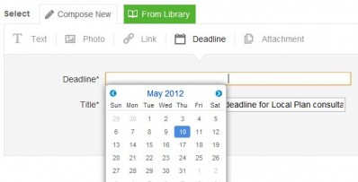
Deadlines (or other dates) can now be set.

Our experience of cycle campaigning is that it's often easy to miss a consultation deadline or some other date, if there's a lot going on. By then, it's too late, and the opportunity to see improvements to cycling are missed.

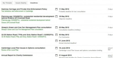
The set dates are now listed in 'My Cyclescape', the user's main summary area. We'll be developing this interface further.

Collision data:

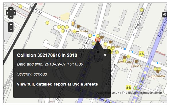
Collision data is now integrated, using a new data feed from CycleStreets, and linking through to their collision reports.

This feature has been developed for the Cambridge group, pushed forward because of the large number of planning applications in that area, for which collision data can often provide a useful context.

Development of this feature, and various underlying code pre-requisites, has been possible thanks to a grant from Cambridge Sustainable City, whose support has been invaluable.

This screenshot, for instance, shows the site of collisions in Mill Road, an area subject to continuing pressures on cyclists from lorries. Several planning applications in recent years would have benefitted from this data being available.

The finalised interface for collisions isn't quite in place yet - buttons for this will be added to finish it off.

Per-thread attachments:

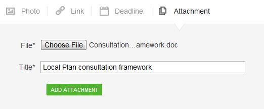
Attachments can now be added to individual discussion threads. Previously the only way to add an attachment was to add it to the Library, which is always public.

Currently there is a slight limitation that, if e-mailing to the discussion thread (since you can reply to things via e-mail, not just via the website), attachments do not get through. We're working on this!

Committee-only privacy setting:

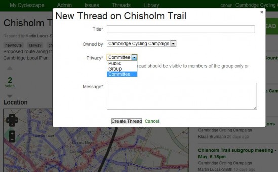
There are now three privacy options for each discussion thread:

  • Public (publicly visible)
  • Group (i.e. available to all members of the group)
  • Committee (available only to current Committee members)

The latter option means that groups can discuss sensitive matters in privacy if required, e.g. pre-consultation plans from a developer.

There is a setting in the group's area which sets the default (public/group) when their members start a discussion thread.

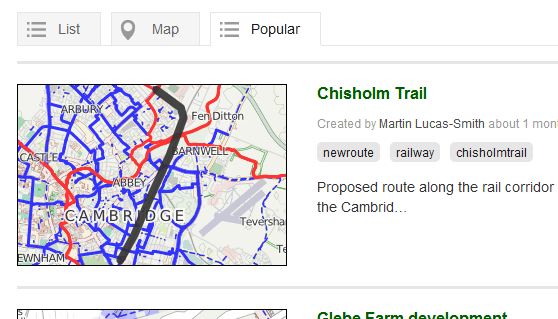
Cyclescape has a voting system, which now results in a list of popular items, ensuring that key strategic issues can stay floated to the top.

More will be done to expose this feature in due course, as the rest of the interface is improved, but the underlying functionality is now in place.


The What's New? link at the end of each page on the site has a log of individual features and bugfixes as they are put in.

Bit by bit, the site's functionality and interface is falling into place!

In our next blog post we'll talk about what we're currently working on, i.e. what's missing and what's not yet finished.

How are our beta testers doing?

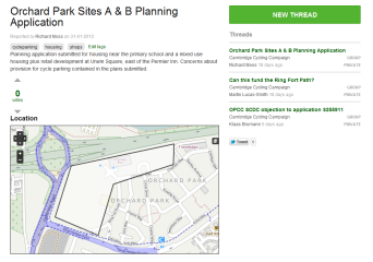
Discussing a planning application - note how the location of the site has been drawn out

About three weeks ago we opened up Cyclescape to a test group, Cambridge. Their Committee have been using the system instead of the e-mail list they used to use.

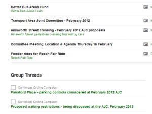
On the right, you can see a planning application being discussed, with the location of the site marked out, and a list of the discussions.

In this three-week period there have been:

  • 78 issues (problem reports and things to work on)
  • 108 discussion threads (discussions connected to the issues)
  • 789 messages (individual replies within the threads)
  • 61 user locations (areas that people have set to be informed about changes in)
  • 22 campaigning deadlines and dates
  • 34 library items
  • 151 pieces of feedback about the system, some of which are about tiny fixes, others about more substantial issues (most of which we know about)

Although there are unfinished areas (which have caused some user confusion) and some missing features, the testing has given us plenty of useful feedback, which we’re working through before we open up the system for wider use.

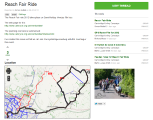
Organising a group ride

How are people using the system?

"The use of maps at the centre of Cyclescape illustrates the point that if a picture is worth a thousand words, so is a map.  The maps really facilitate sharing issues and solutions to them. They also mean that you can easily filter which topics are relevant to where you work or live.

Cyclescape is also a big advance on email lists in the way in which threads can be followed and documents stored for future use in an easy to find location."

- John

We’ve seen discussions on, for instance:

  • Various local planning applications – on which it’s been useful to see the location on the map
  • Smaller issues around a city
  • The Times “Cities Fit For Cycling” campaign
  • Administrative discussions (organising day-to-day things)
  • Organisation of a cycle ride – which again the geographical location provides useful context
  • Addition of some items to the resource ‘library’ which will be useful for future discussions

Items from the library (here 20mph guidance) have been automatically matched, and a user has added some to the discussion

There are signs that the ability for people to subscribe only to things they’re interested in, based on geographical location(s), should work well – so that people can be involved in things they care about – but not overwhelmed with issues.

We’ve seen some confusion over the difference between ‘issues’ (problems) and ‘threads’ (discussions of those issues), which further interface work will address.

Key themes

Some of the key themes, on things we need to fix, are:

  • The need to reorganise the various listings screens, which are currently not in their final positions. This is an area we knew would need quite a bit of iteration work.
  • Making sure that maps are viewable in a few places where they’re currently omitted.
  • Reducing the ‘friction’ between issues and threads. We want to encourage people to locate issues geographically when possible. To some extent this will be improved naturally as the listing screens get reorganised and as we fix up parts of the design that were not finished when we went live.


  • Various layout fixes to add some more polish and improve usability.

Some of the areas are quite Cambridge-specific, partly dealing with the unusually heavy level of correspondence and involvement that the Cambridge group has. Others, as shown above are more generic.

  • Further work on e-mail integration. Many areas work, but some kinds of notifications can’t be replied to by e-mail yet, and it’s not yet possible to start a thread by e-mail.
  • Very active campaigners have asked for an ‘opt-in to everything by default’ setting, so that they get told about everything, and can opt-out when not interested (rather than merely getting told about something new in their area). This would save them having to subscribe to each issue or discussion thread as it comes in.
  • How to deal best with city-wide issues, and the question of a neighbouring Local Authority (South Cambs) whose issues also particularly affect the area in terms of different planning policy.
  • There have also been some compatibility problems with a certain web browser... Internet Explorer!

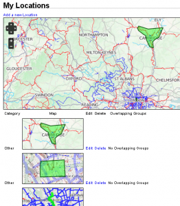
An example problem that we need to fix - city-wide issues are overlapping and obscuring others, so a fundamentally different approach for city-wide issues might be needed, e.g. a separate listing screen or maybe a button to show these:

Usability testing

We’ve also done some individual usability testing, which has thrown up 35 actionable issues. Around half of these were things known about and planned to be fixed, but the others provided useful insight.

Next steps

We’re busy working on fixes for the above, as well as creating more guidance on installing the system for coders who want to get involved. Technical people can watch progress in our Github repository.

Stay tuned to the blog in the coming month as we talk about the latest changes and showcase the system’s features. We’re working as fast as we can, within the available funds, to get the system ready for wider use!

Feature focus: Issues and threads

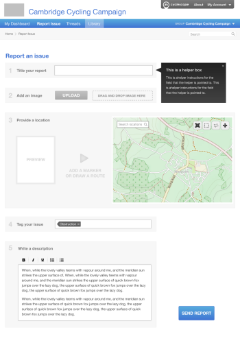
Here are some of the designs for three of the main areas of the site: reporting an issue (problem), viewing it, and discussing it.

At present there are two parallel streams of work going on: feature coding (by our coding team of Andy and Andrew), and design work (by the designers we've appointed, Supercool). We’ll be talking more about how this design work is being developed in another blog post soon.

1. Report an issue

We all know that there are many infrastructure problems in the UK that act as barriers to getting more people cycling, or improving the safety and convenience of existing cyclists. Each of these we call an issue. Examples are:

  • Lack of cycle parking at a destination (i.e. a single point location)
  • The absence of a cut-through route that would shorten journeys (which you could draw on a map as a line)
  • A large hostile roundabout that has no cycle provision (basically a whole area!)

Cyclists will be encouraged to use the site to report these problems, locating them on a map.

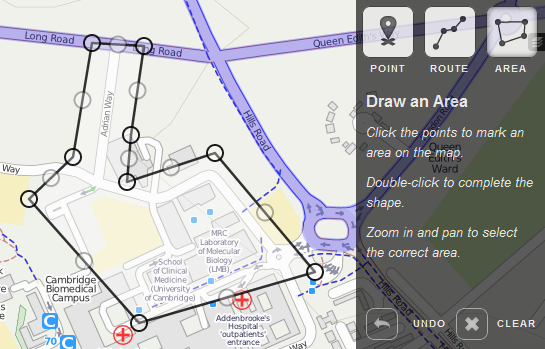
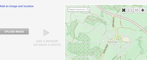
When adding an issue, you can show it on the map as a single point, a line or an area. You can also add some tags (keywords) that help categorise it. And if you have a photo, you can add that too.

2. The issue page – showing a reported issue

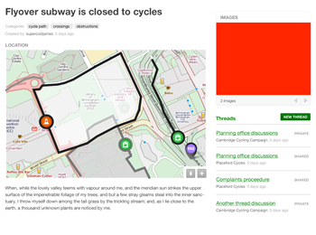
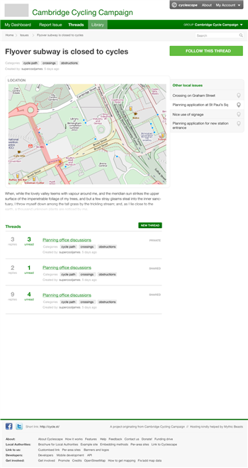
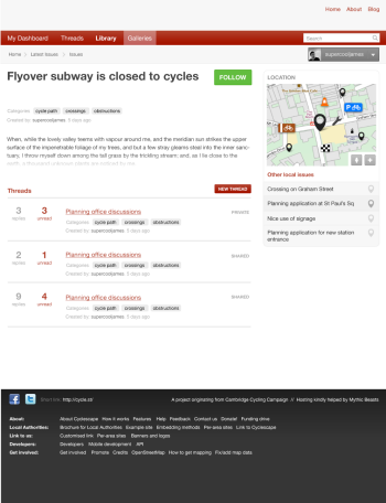
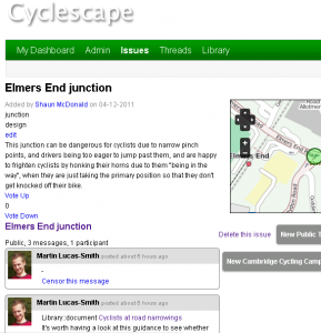
Each reported issue has a page of its own. These issue pages are public. They describe the reported problem, showing its position on the map, as well as other details.

Note how the different types of things – areas, routes and points are shown.

On the right hand side is a list of discussion threads that a group is having about this issue.

3. Threads: individual discussions of a particular issue

As shown above on the issue page, for each issue there may be one or more threads of discussion.

For instance, getting our hostile roundabout fixed will require a lot of discussion. There could be discussions on:

  • alternative routes that could be created;
  • how cycle lanes or cycle tracks could be added;
  • how a similar problem has been solved in another area;
  • potential funding sources that could be tapped into;
  • what the planning office at the Council has been saying about the area; and 
  • a proposed solution that someone has come up with.

These discussions are specific to each cycling group using the system, and can be public or kept private to the group - we know that different groups work in different ways, as results from our survey are clearly showing.

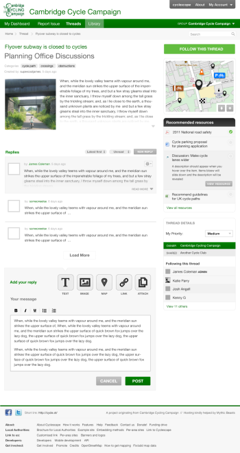
Below, we show the page for one such discussion.

We’ll cover the thread page in more detail in a future blog post, but the key things are that it shows us a clear title, a description of the issue, the location, recommended resources that might be useful to bring into the discussion, replies to the discussion, your prioritisation of the issue, and a list of who is following it.

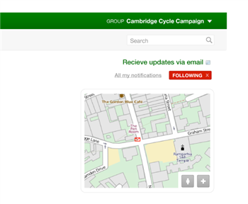
The button in the top-right lets you subscribe to an issue, so that you only get notified about things you actually care about, rather than every discussion.

If you use e-mail a lot, you can opt to receive updates by e-mail as well - again, another thing that our survey has shown is likely to be needed.


December review

Here's a quick report prior to the downing of tools for the Christmas holiday.

Since our last report two weeks ago, the following items have been implemented:

  • Library notes and document upload implemented.
  • Thread messages can be replied to by e-mail.
  • A user can set the locations and areas they are interested in, such as their home or route to work.
  • Tagging of issues, threads, and library items is possible.
  • Users can submit feedback from the site.
  • Issues can be voted up and down to indicate popularity.
  • Users can prioritise individual threads (each of which is a discussion on an issue, and an issue may have many threads).

Those with technical interests can see the great progress our developers Andy and Andrew are making, in our codebase, which is open source.

Our developers have documented bugs and contributed patches to other open source projects that we use. This includes submitting a crash bug report to the core Ruby language implementors (now fixed), a minor patch accepted by the Phusion Passenger team whose software powers many Rails deployments, and several bugs with fixes for the Chef deployment system.

New design work from Supercool has continued to come in, and we are plugging this into the code as fast as we can - though there's lots of other things to sort out too!

Here's some of the design latest work, though we are continuing to iterate work on the design and its implementation:


Design screenshots

These are the latest design templates from Supercool that we’re now busily hooking into the code!

Report an issue page:


Thread discussion page:


Issue page – each thread of discussion on issue:


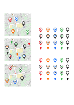
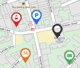
And an icon set under development for the map markers:


Moving into beta

We’re approaching our beta phase now, with testing of a closed early beta starting today by members of one of our stakeholder groups.

Our designers, Supercool, have been working hard on the overall design and page templates, which we’re merging into the code this week.

Thanks to the hard work of our developers Andy and Andrew, core functionality is pretty-much all in place now, and it is being hooked into the design work that is now flooding in. (Some of the more ancilliary areas, such as importing of existing Photomap data, haven’t been started yet so we can get testing going more quickly.)

They've also been adding a lot of tests and other deployment infrastructure which ensures that the system is robust and easy to deploy.

Our timescale has slipped about one month, due to the amount of functionality going in and some questions on some of the assumptions we made earlier on (see below), but progress remains good. More technically-minded people can follow our code repository to see changes each day.

What’s in place now?

Lots! Most of the core concepts and functionality is now in place:

  • Logins and user profile
  • Users and group management
  • Issue submission (though not photos yet)
  • Core geographical basis (limitation of issues to specified areas)
  • Issues
  • Listing of threads to issues
  • Point/line/polygon basis of issues
  • Thread discussions
  • Deadlines
  • Multiple message types (e.g. comment/photo/link/deadline/library)
  • Subscription
  • Subscription by e-mail
  • Replies by e-mail (mail-to-web gateway)
  • Resource library (though not all types done)
  • User location management (e.g. ‘my areas’)
  • Dashboard
  • Listing of issues by ‘my areas’, by subscription, by involvement
  • Privacy (public/private) for groups and per-message
  • Tagging
  • Thread discussion context (group-based, ungrouped)
  • System feedback

These will need tweaking during the integration of the design templates and the results of testing.

Innovation: testing assumptions

What the early beta testing programme, and work until Christmas, will deal with, are testing and refining the key areas of innovation.

There have been interesting debates amongst the development team which has challenged some of the assumptions in the spec. Some of the differences have boiled down to how much users want to be involved with campaigning issues. We've resolved this into three general levels of involvement:

  • The light user, who wants to browse discussions, and perhaps is only interested in something that directly affects them
  • The involved user, who perhaps has certain specialist knowledge (about their local area or particular technical knowledge on certain infrastructure themes)
  • The super-campaigner, who is perhaps a Committee member and wants to view and be able to comment on almost everything

For instance, the spec assumed that people would be automatically subscribed to everything in their area, meaning that if their main profile settings enabled e-mail delivery they would get a huge amount of stuff. That would definitely suit the super-campaigner profile, but for the light user that would be information overload. So we are considering more fine-grained, but still user-friendly, ways in which ‘subscription’ as a concept is defined.

The other big area of discussion has been about the group basis and how this conflicts with a user-centric approach. The system has always been intended as a toolkit for campaign groups, not a general UK-wide discussion forum. The social context here is that cycle campaign groups act as a corporate voice for cycling issues in an area, and people working together with a group structure and norms helps the long-term basis of campaigning.

But people are sometimes members of more than one group (as the spec recognises) and different groups want different kinds of privacy in their discussions. By contrast, a user just wants to see things they’re interested in, whichever group is discussing them. So in the coming weeks we’ll be working through exactly how the interface can resolve this tension between user-centric and group-centric perspectives.

The three areas that we’re working through are:

  • What subscription means exactly (just a listing, or actively seeing discussions?)
  • E-mail subscriptions (auto-subscription, receive replies, and how threads get started)
  • Group basis (how this affects the user interface and subdomain URLs, and how people can be sure who they’re talking to).

Thankfully, we’re using Ruby on Rails, which is designed to assist with agile development issues like these!

Design screenshots

Stay tuned for news on design screenshots..

Work in progress: Alpha report

Last week we reached the alpha phase of our project.

An alpha (which comes before a 'beta') is the stage of development where the fundamental concepts and much of the underlying structures of the system are in place, but the interface isn't ready and many features aren't in place or finished.

In the coming weeks as we move to the beta, we'll have screenshots and more details.

We've submitted our Alpha progress report which describes process in more detail. There are a few screenshots, but they should not be taken as in any way indicative of the final system - they just have some basic layout to enable code testing.

Designer needed! – Cyclescape design brief

Download this design brief as a PDF.

We are seeking a talented designer with strong web-application user interface abilities to undertake design work for the new Cyclescape website. Timescales are tight. Cyclescape is to be a website (currently under construction) aimed at helping cycling groups around the UK. The work will involve the creation of an overall design concept, plus user interface templates for each of the user pages, and an icon set.

(This contract is for design, not programming. A team of coders are already working on the programming.) 

It is being created by CycleStreets, a not-for-profit social enterprise who run the UK cycle journey planner at www.cyclestreets.net. Programming is already underway.

The site is a grant-funded project, funded by GeoVation. GeoVation is an Ordnance Survey initiative and forms part of the Ideas in Transit project with funding from the Technology Strategy Board and the Department for Transport.

About Cyclescape

Cycling conditions in the UK need to be improved massively. Cycle lanes that end unexpectedly, roads shared with lorries, non-existent cycle parking, etc.. Any cyclist can give you a catalogue of problems that need tackling in their town or city. The end result is far fewer people cycling than there should be.

Cycle campaign groups are key to changing this. These groups – large and small, national and local, are the people on the ground who work make cycling better.

Cyclescape is to be a comprehensive online campaigning toolkit to assist cycle campaign groups around the UK. In the words of one supporter, it should be "a hugely important step forward for all cycle campaigning groups". We're working to provide groups with a really great, useful and user-friendly system that will save a lot of time and effort.

The project’s blog at https://blog.cyclescape.org/ contains more details and progress reports.

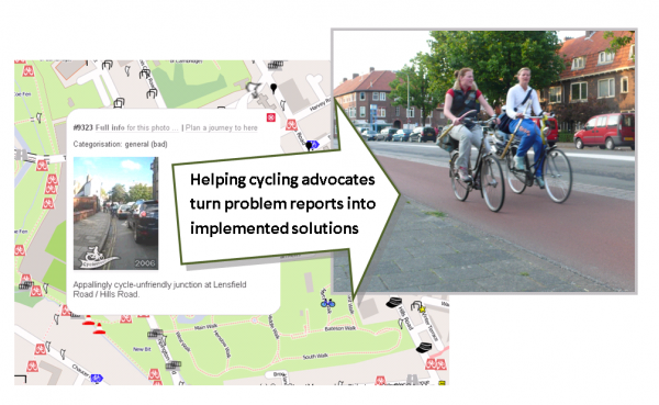
Turning cycling problems into solutions

Overview of functionality on the site

Some of the things the new system will be able to do are:

  • Enable members of the public and campaigners easily to pinpoint where cycling is difficult
  • Enable simpler and more focussed discussion based on specific issues, groups of issues, or themes
  • Enable best practice to be 'pulled-in' to discussions, by providing off-the-shelf examples shared from elsewhere in the UK
  • Help groups prioritise what to work on
  • Enable groups to include Council contacts in these discussions if they wish
  • Pull in planning application data automatically, so that potential issues needing attention are readily accessible
  • Automatically notify and involve people who cycle through an area – who therefore have an interest in seeing issues fixed
  • Make geographical data such as collision data and accessibility analysis easily available, to provide context
  • Enable groups to assemble 'solution' resources so problems can be resolved on the ground
  • Give groups a variety of ways of publishing their activity on their website easily.

A more detailed two-page description of the site is available at
https://blog.cyclescape.org/images/ToolkitDescription.pdf

Timescale

We are keen to appoint a designer as soon as possible.

The site will become available to groups during December. We would like to have a design in place by late November (or earlier if possible). We realise this is a tight timescale.

Usability

The site will be used by cycle campaigners who have a wide range of technical abilities, many with little experience of web applications. Also, some of the users will be particularly heavy users. The interface therefore needs to be as self-explanatory and streamlined as possible.

Given the tight timescale, we expect more emphasis on graphic design rather than user interaction design. A designer should be knowledgeable about the latter, with a good understanding of usability and IA issues. The project’s manager from CycleStreets has good usability knowledge.

Mapping is a particular aspect where the site will need usability work, e.g. how to represent showing both ‘points’ and ‘areas’ together on a map). Specific ideas/knowledge in this area would help.

Design principles

The design and usability must:

  • Be attractive and clear
  • Contain plenty of whitespace: we don’t want a cramped design
  • Clearly guide a user through the workflow of the site
  • Appear open and welcoming to new people to join in the debate
  • Have a chrome design that is separable from the internal pages, so that the functionality is embeddable in other sites (see below).
  • Enable users to interact with maps easily
  • Be fast-loading, i.e. not image-heavy

Here are a few sites whose designs/UI we like. Obviously we are not asking for these in any way to be emulated, as design must be original, but this should hopefully give a flavour of the sorts of modern design approach we want.

Likely pages

The number one requirement is for the page template concept that sets the style and tone for the whole site. This is a 'from-scratch' project to create the "organisation’s" branding.

Here is a list of the main pages that will be produced. There will be some more, but not substantially so, and we would expect to be able to adapt the finished design to pages with new forms/content:

  • Main front page
  • Report an issue page (for submitting a problem location, with or without a photo)
  • Login page and account management pages
  • Register a group page (e.g. cycle group has their own discussion area)
  • User management pages (for the group’s Committee)
  • Issue page, showing a reported problem
  • View all issues on a map
  • View issues by listing
  • Forum-like ‘thread’ page, where a reported issue is being discussed. This will need to include the concept of blocks of info that can be ‘pulled into’ the discussion, with just a summary shown. Users can then click to ‘open out’ an info block to reveal more info.
  • User dashboard
  • ‘My issues’, showing all the issues they are discussing
  • Help/documentation pages
  • Gallery page showing several photos
  • An HTML e-mail with a reply by someone else to a discussion the user is subscribed to
  • Pages where ‘info blocks’ (basically shareable resources) can be created (wizard-like format)
  • Listing of info blocks

If you can design a logo also that would be additionally useful. If not, we will seek a volunteer but obviously the logo and design will need to have unity.

We would not expect all of these pages to be created at once, but would see these as being worked through, with a few done initially to ensure the concept works well.

Ability for groups to embed Cyclescape in their own websites as a web application

A complication of this site is that it should be possible in future for cycle campaign groups to embed the Cyclescape site as a web application forming part of their own sites. This would mean that the site chrome is not present, but the primary navigation and other functionality should be. We are prepared for some compromise on this as time is tight, and would welcome thoughts in your application.

By way of example, CycleStreets has created these sites which show how its journey planner is embeddable in other sites. (The web application code determines which site chrome to use based on the URL.) Note that the internal design/layout is the same, except for slight font changes.

Technical requirements

We would prefer a designer who can supply finished XHTML/HTML5 and CSS2/3 templates, although if you do not have well-developed skills in that area we can do the conversion from Photoshop.

We are happy to consider progressive enhancement techniques that have reasonable browser support. For instance, we would be happy for gradient buttons to use CSS gradients (with a solid colour as fallback) to be used rather than an image background.

By way of background, the site is being coded using Ruby-on-Rails, jQuery and OpenLayers.

Applications

Please contact Martin at info [at] cyclestreets.net by midday on Thursday 3rd November if you are interested to bid for this work, outlining your interest, comments on any aspects above, your existing portfolio and your proposed fee level and availability timescale.

Do not send any design mock-ups with your application. We are strongly opposed to design-on-spec and any such applications will be binned.

Applications will be considered on an equal opportunities basis, i.e. on their merits alone.